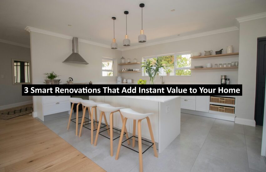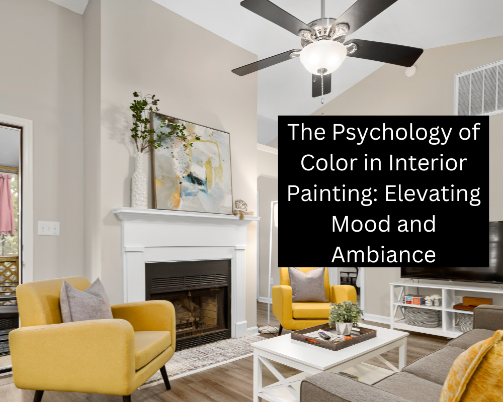
The Psychology of Color in Interior Painting: Elevating Mood and Ambiance
When it comes to transforming living spaces, the power of color cannot be underestimated. Understanding that color is more than just a visual element – it’s a tool that can shape emotions, set the tone, and create distinct atmospheres within a room. For a unique touch, consider incorporating hand-painted designs directly onto your walls as part of your living room wall decor ideas. This article delves into the fascinating world of color psychology in interior painting, exploring how different hues can influence emotions and how knowledge of this phenomenon can be leveraged to craft spaces that resonate with occupants on a deeper level.
The Impact of Color on Emotions
Colors have the remarkable ability to evoke a range of emotions and moods. This phenomenon, known as color psychology, has been studied extensively, revealing the profound impact that different colors can have on individuals. Here’s a glimpse into the emotional landscape painted by a few key colors:
Blue: Embracing Tranquility and Calmness
- Imagine entering a room adorned with serene shades of blue. This color, reminiscent of the vast open sky and the tranquil ocean, has an innate ability to evoke feelings of calmness and relaxation. It’s as if the stresses of the day are gently lifted, replaced by a soothing embrace.
- Blue has been known to slow down the heartbeat and lower stress levels, making it a natural choice for spaces that invite unwinding and reflection. While planning your interior painting project, don’t forget to factor in any potential repairs identified during your regular home inspections. Whether it’s a cozy bedroom, a spa-like bathroom, or a serene reading nook, the gentle touch of blue on the walls can transform these spaces into havens of tranquility, allowing the mind to find solace and escape from the hustle of the outside world.
Red: Igniting Passion and Energy
- Bold and unapologetic, red is a hue that commands attention. It’s a symphony of energy and warmth, igniting the senses and sparking a fire within. Walk into a room adorned with red accents, and you’re greeted by a passionate embrace that can uplift even the dreariest of moods.
- Red has the remarkable ability to stimulate conversations and foster connections, making it an ideal choice for social areas where lively interactions thrive. From a strategically placed red statement wall that draws the eye to the heart of the room, to carefully curated red furnishings that exude a sense of opulence, this color can transform spaces into dynamic hubs of enthusiasm and life.
Green: Nurturing Balance and Harmony
- In the realm of color, green is the embodiment of nature’s embrace. Like the lush foliage that carpets the earth, green resonates with a sense of balance and harmony. It’s a whisper of growth and renewal, a reminder of life’s cycles. Incorporating green into spaces creates an invitation to connect with the outdoors, even within the confines of walls. This makes it perfect for areas where rejuvenation is sought, such as cozy reading corners, meditation rooms, and spaces that seamlessly blend indoors and outdoors.
- The gentle infusion of green fosters an environment that encourages both inner reflection and a connection to the natural world, promoting a harmonious balance within.
Yellow: Infusing Joy and Positivity
Step into a room adorned with sunny shades of yellow, and you’ll find yourself bathed in a warm and uplifting embrace. Yellow is the embodiment of optimism, a burst of sunshine that can instantly lift spirits. It’s a hue that radiates joy and positivity, inviting a sense of brightness into any space it touches. However, just like the sun’s intensity, yellow should be used thoughtfully. Consider a calming light blue for your home office walls to promote focus and tie in with your overall home office designs. An accent wall or carefully selected furnishings in shades of yellow can infuse a room with energy and cheerfulness, but an excessive use might lead to restlessness. When used in moderation, yellow becomes a beacon of optimism, reminding us that even on cloudy days, there’s always a ray of sunshine to be found.
Read: Decorating Your Patio for Summer: 6 Design and Decor Tips
Neutral Colors: Elegance in Versatility
- In the symphony of colors, neutrals take on the role of the conductor, orchestrating a harmonious balance. Colors like beige, gray, and white may seem subdued, but they hold the power to transform a room into a canvas of possibilities. Acting as calming backdrops, neutrals provide a canvas for other elements to shine. They are the silent companions that allow art, furnishings, and accents to take center stage.
- Neutrals create an elegant foundation, setting the stage for contrasts and accents to play out their visual melodies. Their versatility ensures that they seamlessly adapt to various design styles and aesthetics, allowing for effortless combinations that result in visually captivating and aesthetically pleasing spaces.
Applying Color Psychology
Understanding color psychology is essential when it comes to interior painting. Expertise lies not only in brush strokes but also in the ability to curate an atmosphere that aligns with clients’ goals and the function of each space. Here’s how this approach is applied:
Client Consultation
During client consultations, professionals engage in in-depth discussions to understand the client’s preferences, the intended purpose of the room, and the specific emotions they wish to evoke within the space. This valuable information becomes the foundation upon which color choices are made. By tailoring colors to align with the client’s vision and emotions, the painting project becomes a personalized and meaningful experience.
Harmonious Color Schemes
Leveraging their understanding of how colors interact, experts create harmonious color schemes that facilitate a seamless transition between different rooms. By carefully selecting colors that complement each other, they prevent abrupt visual shifts that could disrupt the desired mood or ambiance. This cohesive color flow contributes to a more visually pleasing and emotionally consistent environment.
Creating Focal Points
Professionals strategically integrate accent walls or focal points painted in vibrant and attention-grabbing hues. By doing so, they guide the viewer’s gaze and provide a sense of depth to the room. These carefully positioned focal points can trigger the specific emotional responses desired for the space, enhancing the overall atmosphere and making the room feel dynamic and engaging.
Balancing Contrasts
Achieving a visually stimulating environment without overwhelming the senses requires a delicate balance of contrasting colors. Experts take into account various factors such as the room’s lighting, existing furniture, and architectural elements. By skillfully mixing contrasting colors, they add interest and energy to the space without creating a chaotic or disorienting effect. This balance of contrasts contributes to an inviting and visually appealing atmosphere.
Conclusion
Color is more than a visual delight; it’s a tool that can shape the way we feel and interact with our surroundings. Dedication to understanding color psychology elevates work from mere painting to artistry that enhances the very essence of a space. With each stroke of the brush, spaces are infused with emotions, crafting environments that resonate with occupants and contribute to their well-being. As you consider your next interior painting project, remember that the right colors can do more than just please the eye – they can touch the soul.